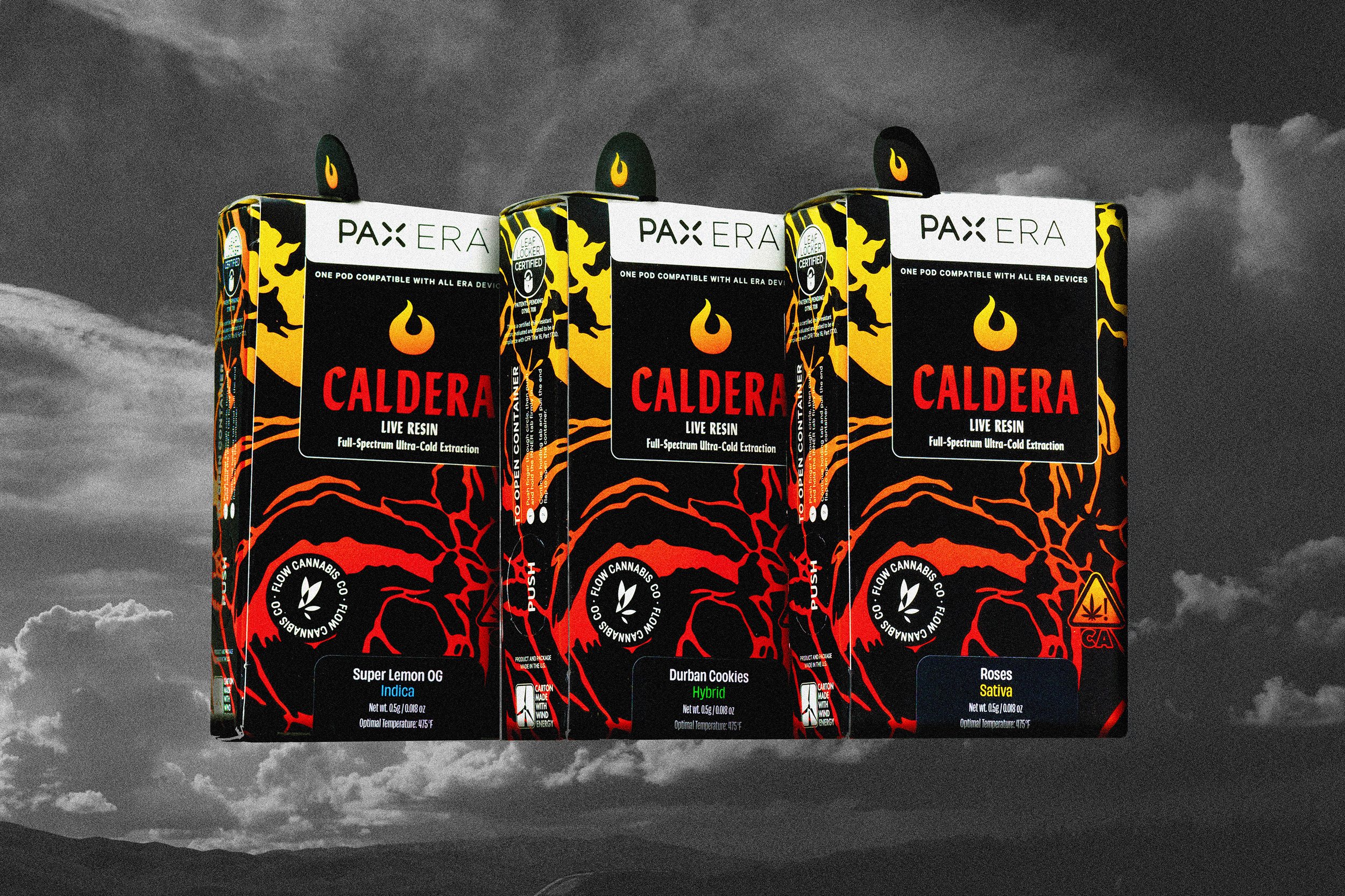
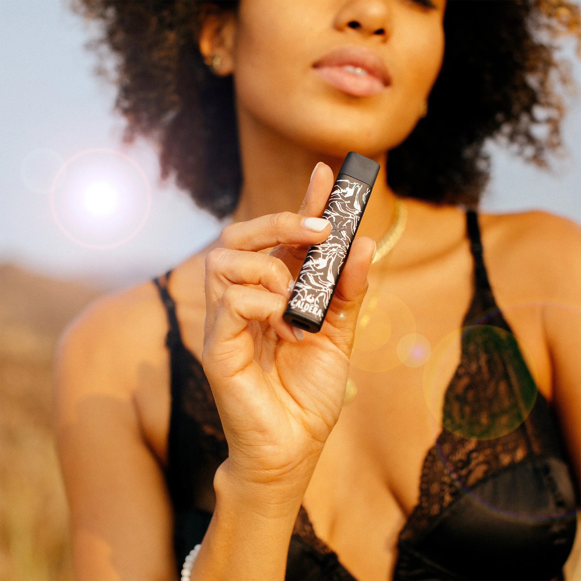
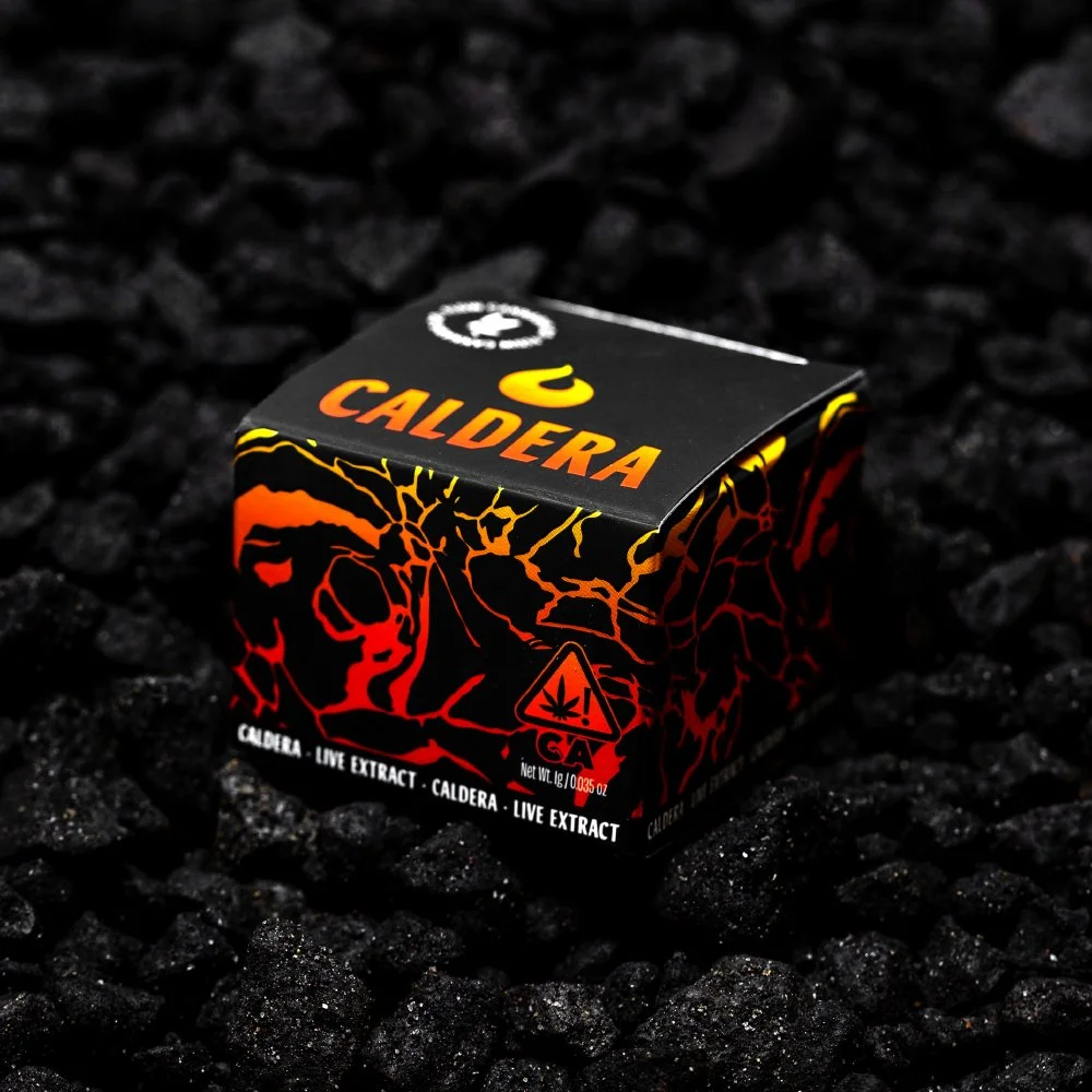
Caldera
While working as the in-house senior graphic designer at Flow Kana, a sustainable wellness brand, I led brand development & design from concept through launch for the sub-brand Caldera, presenting design directions to leadership and collaborating with cross-functional teams to bring the brand to the California market. Caldera blends science and innovation to create premium cannabis products.
Role
Creative Direction
Brand Strategy
Visual Identity Design
Packaging Design
Impact
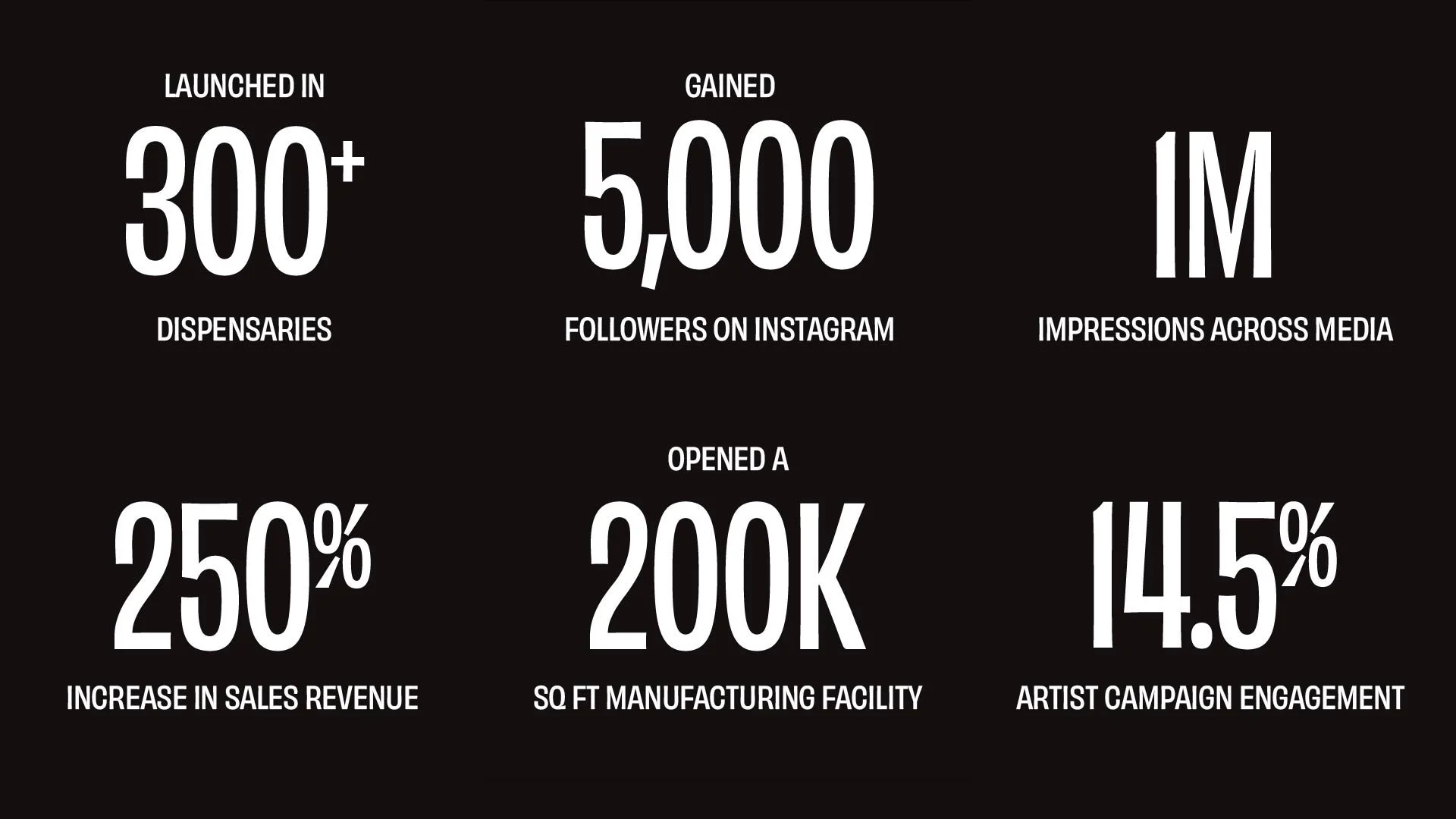
👁️ 1 million impressions across media
🚀 Launched in 300+ dispensaries in CA
📱 Gained 5,000 followers on social media

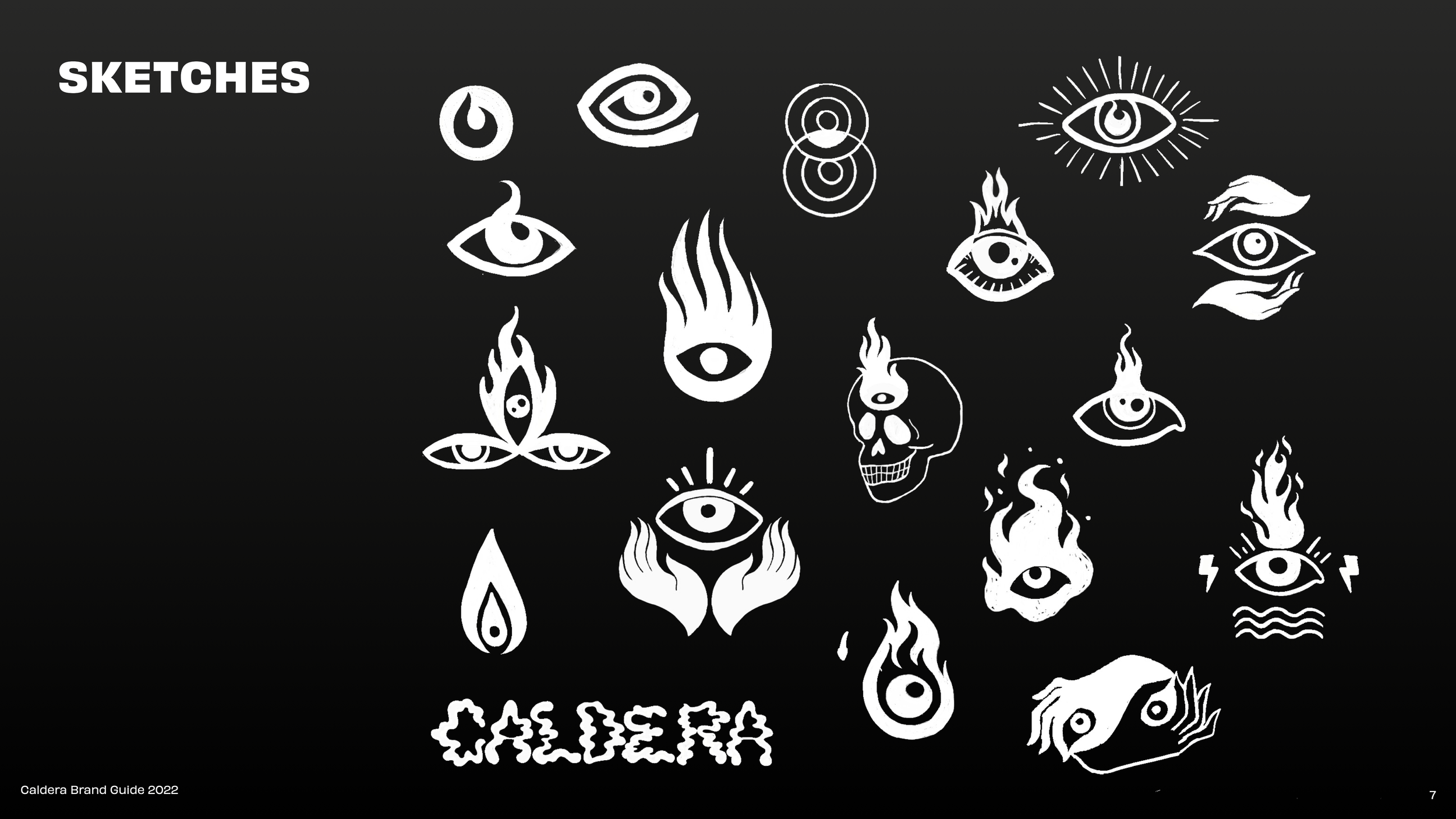
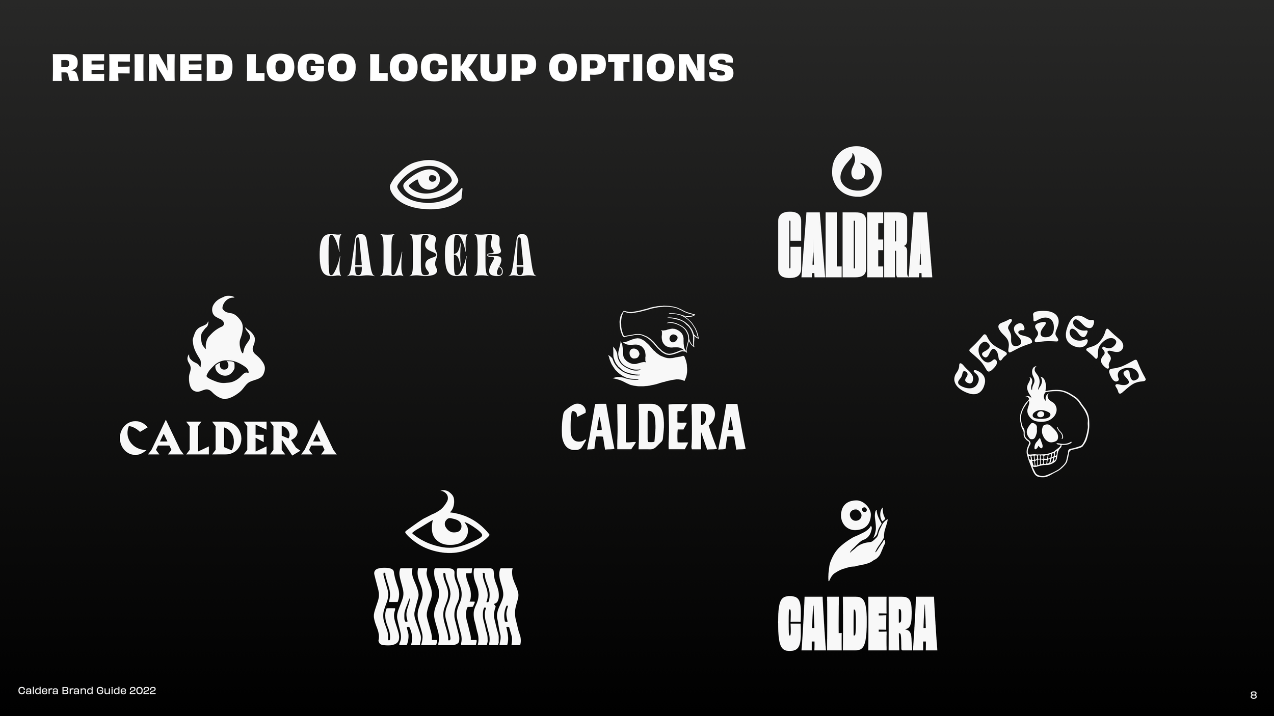
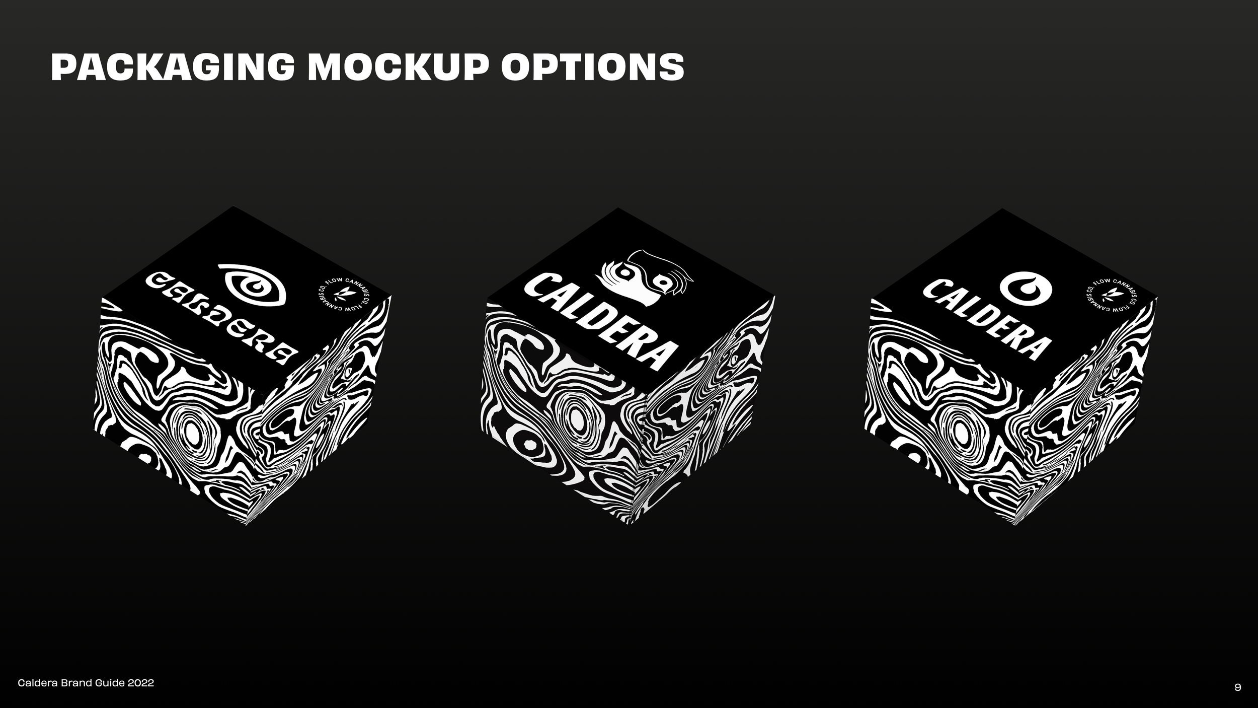
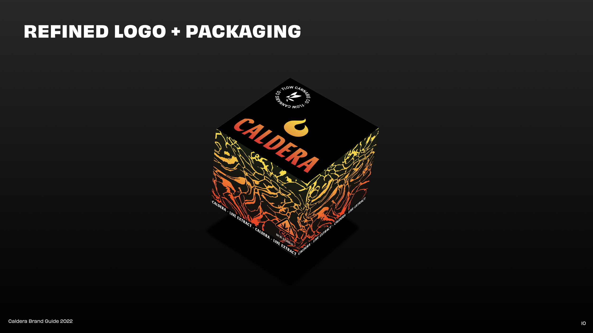
Design Approach
The brand identity draws inspiration from volcanic landscapes, connecting natural elements with scientific innovation.
Key design elements included:
A volcanic-inspired color palette
Bold typography for strong shelf presence
Natural textures referencing lava and geological formations
Playful visual elements that acknowledge recreational cannabis culture
This approach allowed the brand to feel premium and authentic without becoming overly clinical or corporate.
Goals
Build brand loyalty
Increase awareness through authentic marketing campaigns
Differentiate the brand in a crowded cannabis market
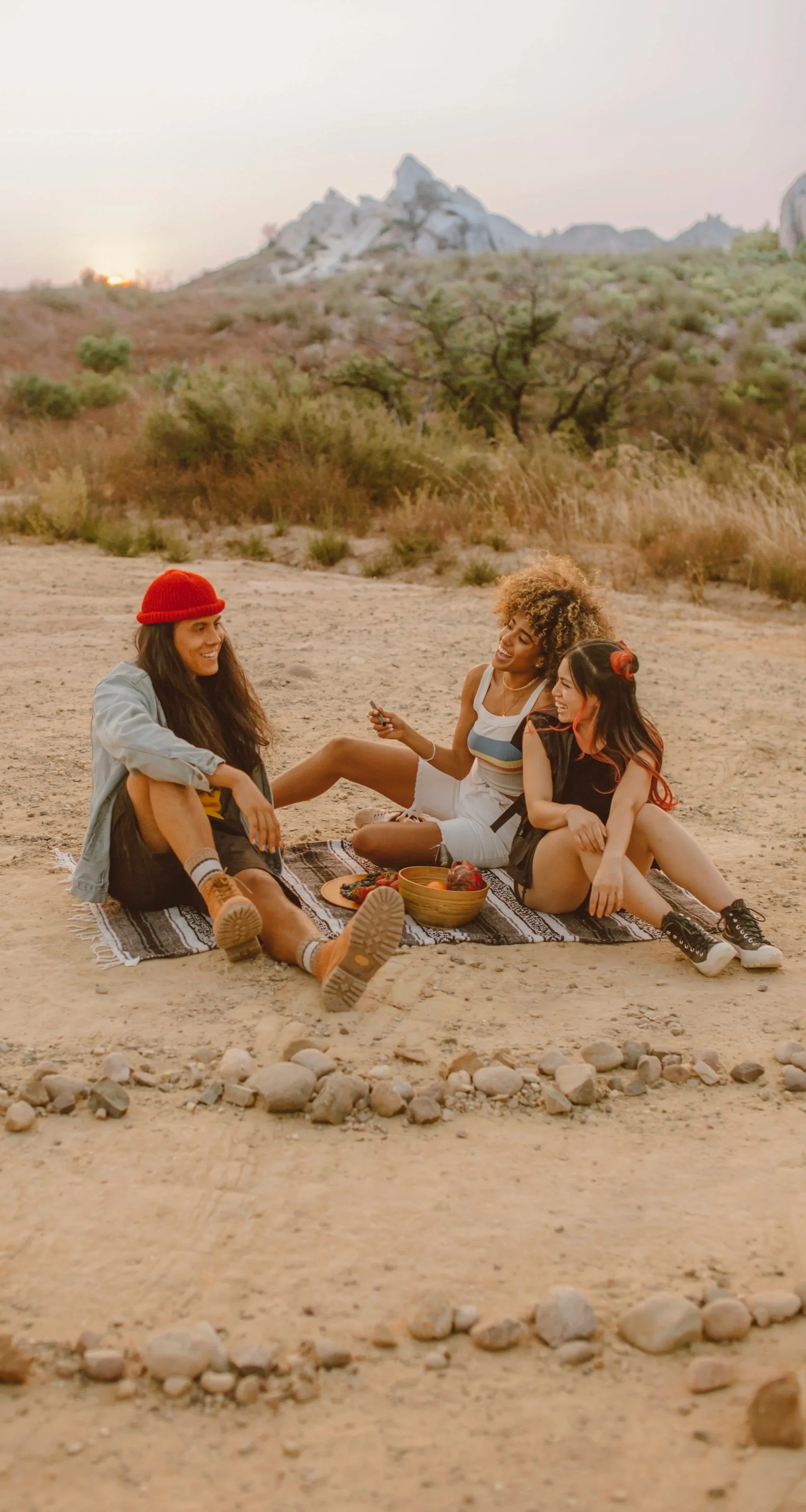
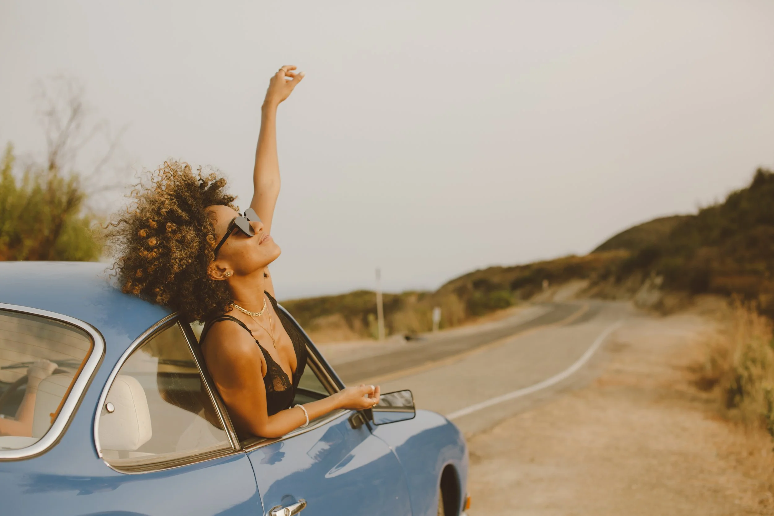
Audience Insight
Using Headset.io market data, we identified Caldera’s core audience as men ages 25–35.
To connect with this demographic, we developed a brand voice and visual direction that balanced nature, science, and playful energy.


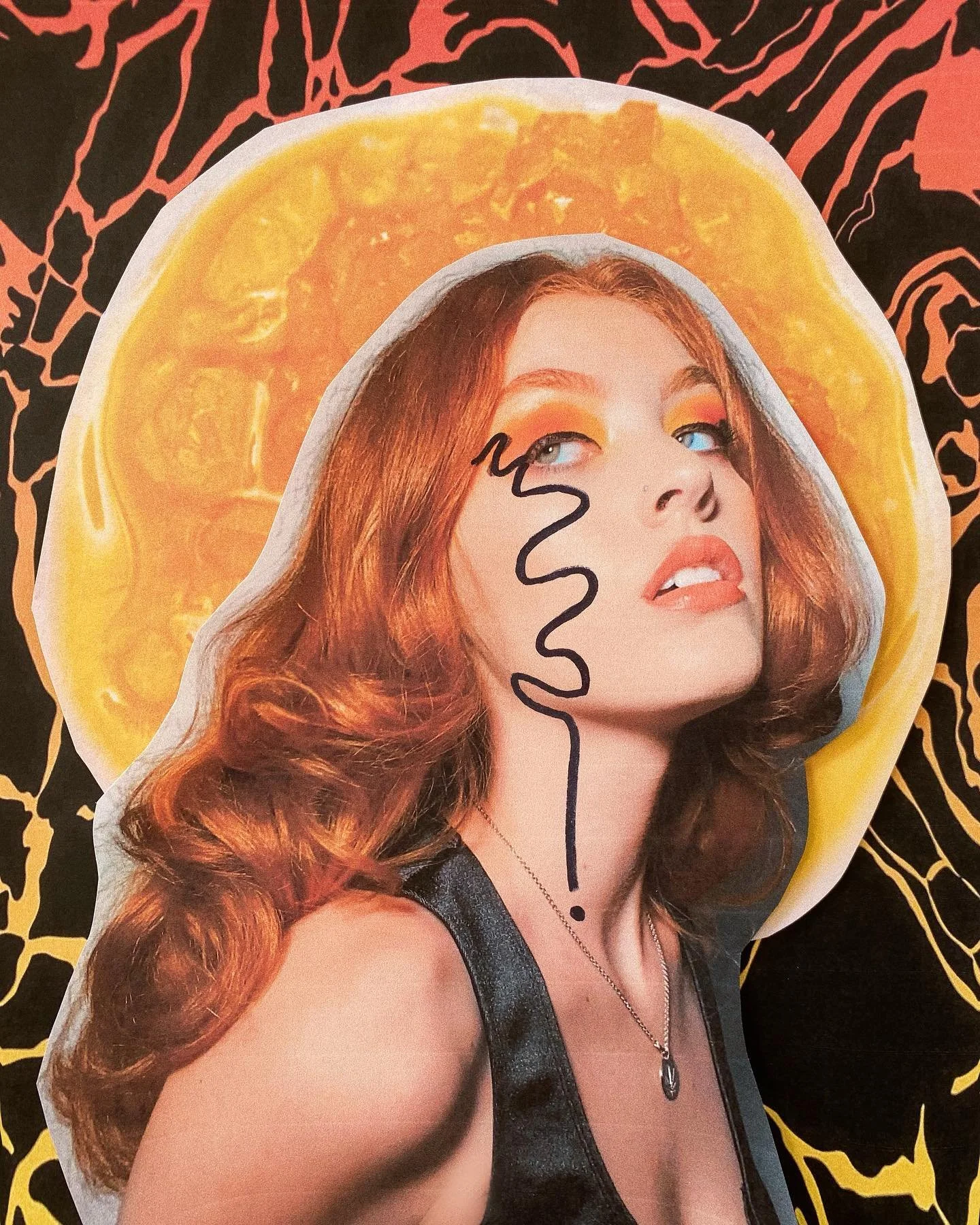
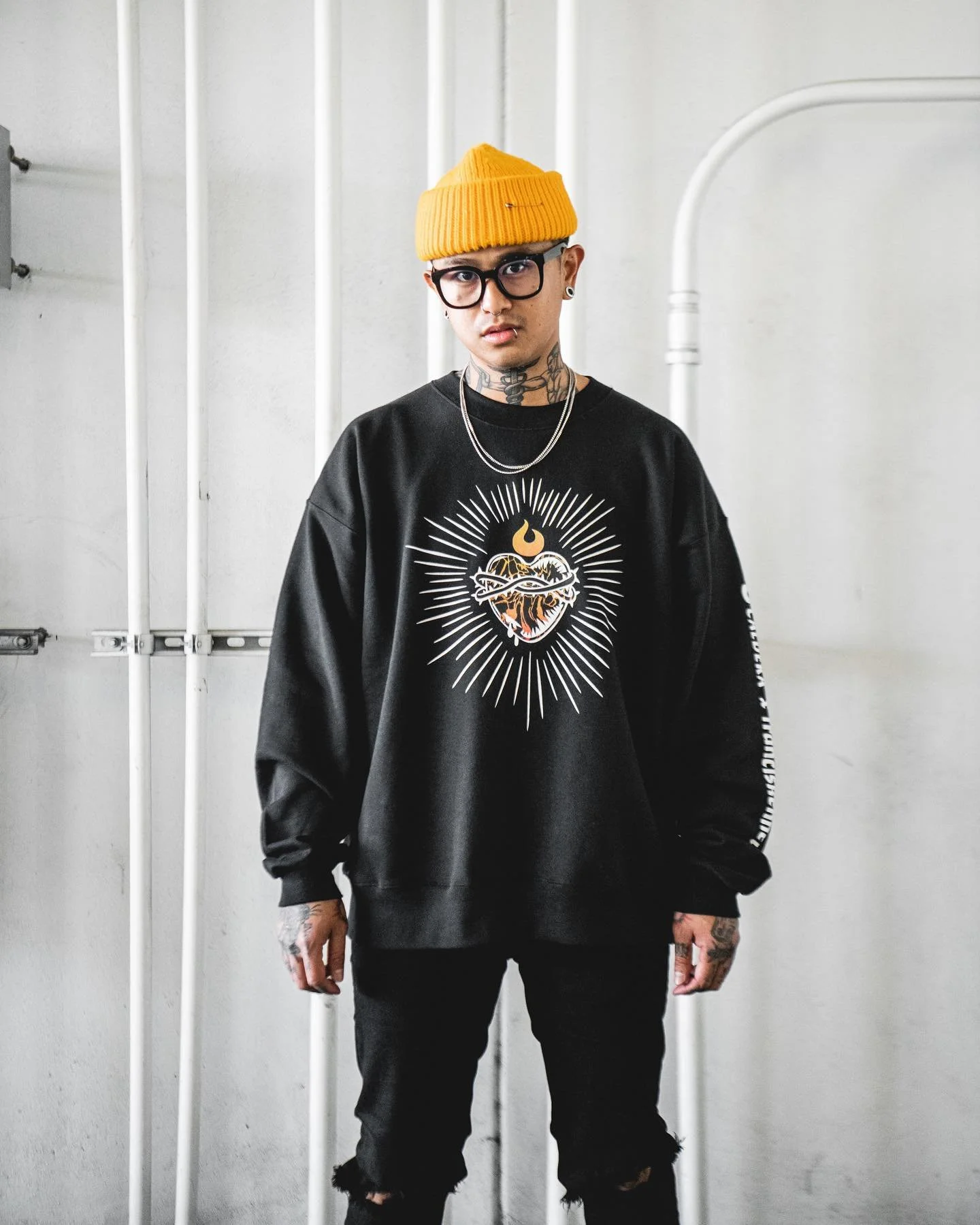
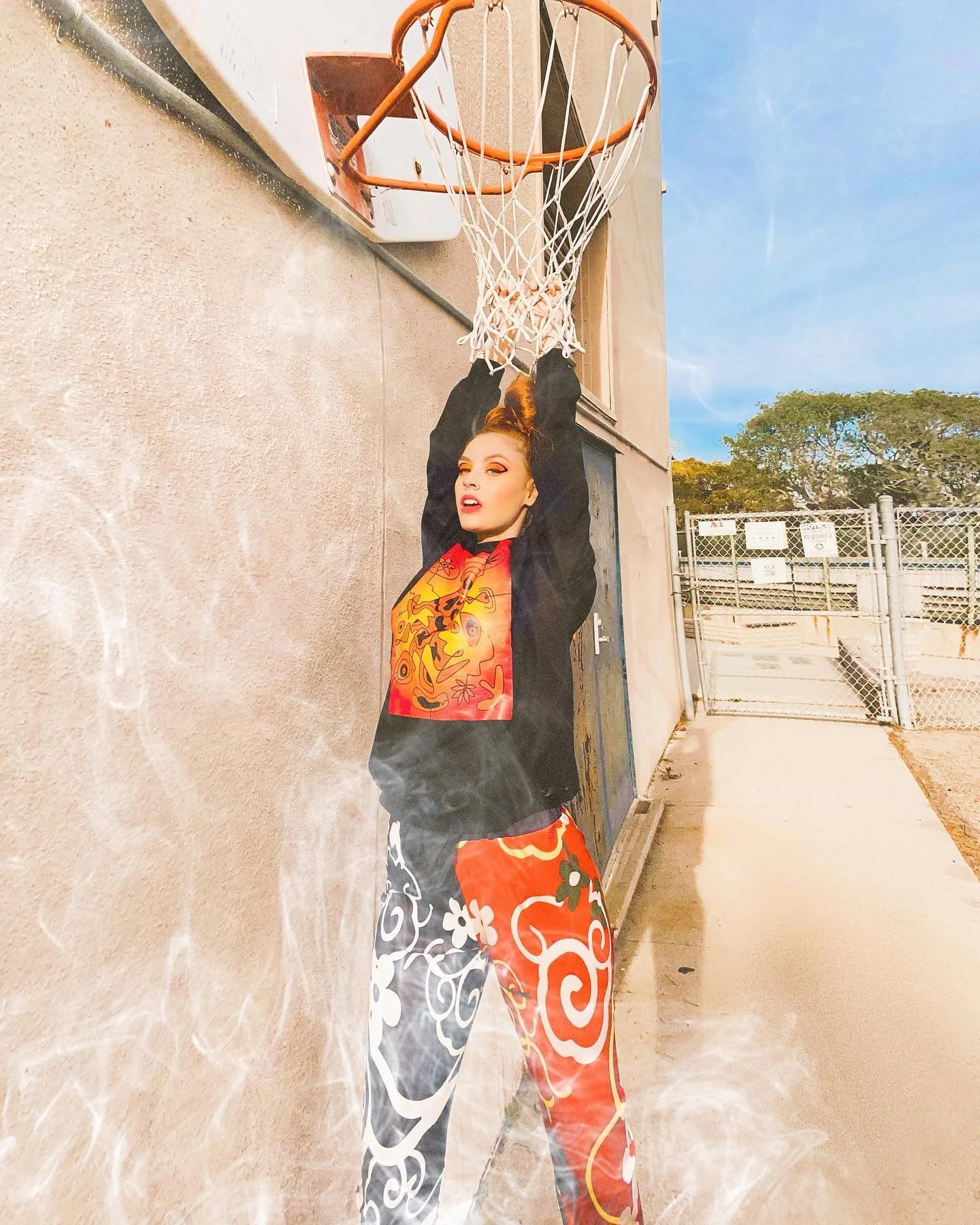
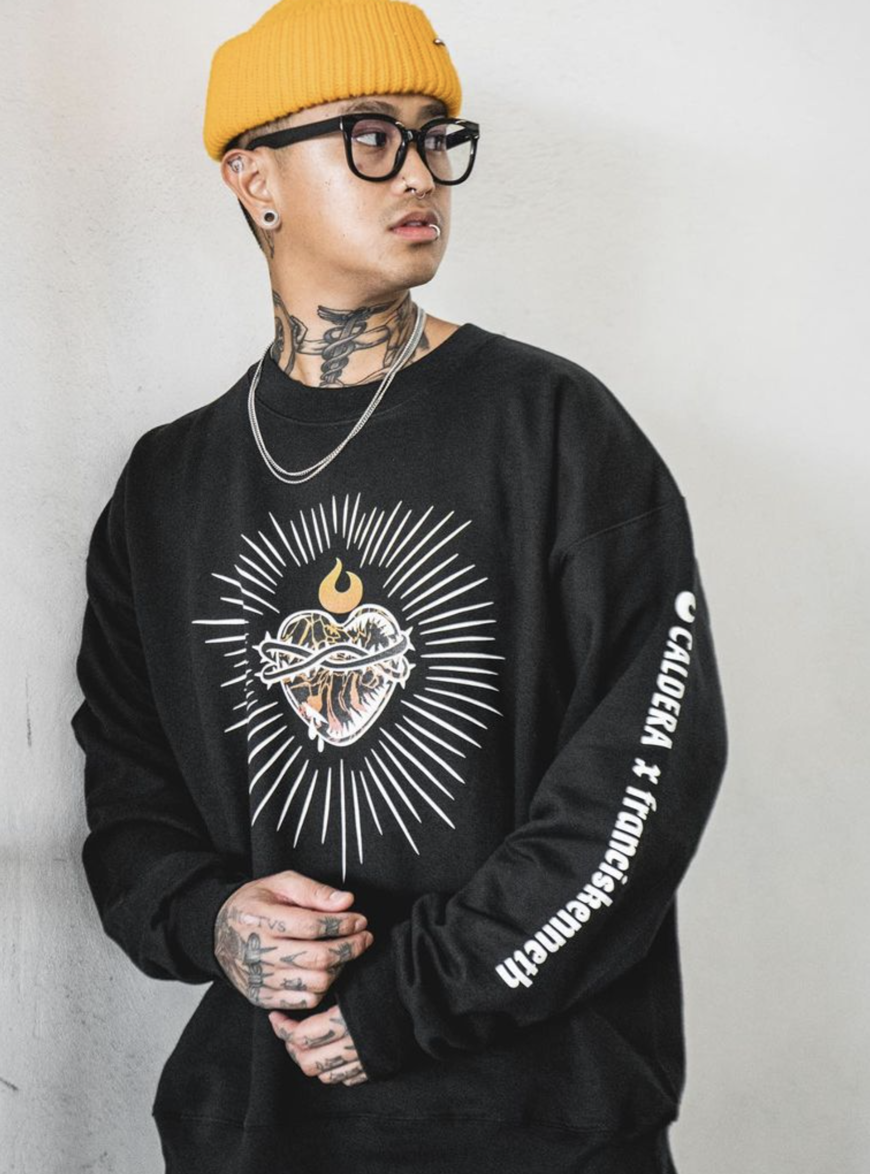
Artist Partnership Campaign
We partnered with social media agency Highlyte to have micro-artist influencers create art focused on the brand’s mission.
“Flow Cannabis Company, creators of Flow Kana sun-grown cannabis, launched their new live resin product, Caldera, with a visually captivating campaign. We collaborated with nine unique artists to bring their perspectives to the Caldera brand. Each artist was asked to create a piece that spoke to their experience with cannabis and how they felt after using the product. The campaign achieved over 63K impressions and a 14.5% engagement rate, with zero account shutdowns, proving that compliance doesn't hinder creativity. Our key takeaway: Branding is an iterative process that evolves with a product, serving as a common language between consumers and the company's values. Collaborative development leads to authentic, mutually beneficial results.” —Highlyte
Design is a Process
My process throughout this project step by step:
Research & Discovery: Determine values, mood boards, audience, run competitive analysis, & brainstorm brand positioning. Presentation to leadership and integrate feedback.
Explore: Sketch logo icons and explore typography, colors, & patterns. Presentation to leadership and integrate feedback.
Refine: Refine 2–3 strong concepts with mockups. Presentation to leadership and integrate feedback.
Finalize: Deliverables, brand guidelines, file handoff.
Review & Revise: User testing and lessons learned for future improvements and refine if necessary.
Brand Guidelines


Post-Launch Metrics