Various cannabis products from Roots, including a jar labeled 'Sungrown Cannabis,' a large paper bag, a live resin cartridge, and a small box, all with orange labels, displayed on orange poppy flowers and green foliage background.

Roots

I led the creative direction and visual identity redesign for Roots, a sustainable cannabis brand, collaborating closely with marketing and packaging leadership. My role involved defining the brand’s core attributes, developing a flexible packaging and identity system, and translating the strategy into a cohesive visual language that balances approachability and sustainability, while improving shelf differentiation and scalability across multiple SKUs.

Creative Direction
Visual Identity
Brand Strategy
Packaging Design

Role

Impact

Improved legibility
Shelf presence in crowded market
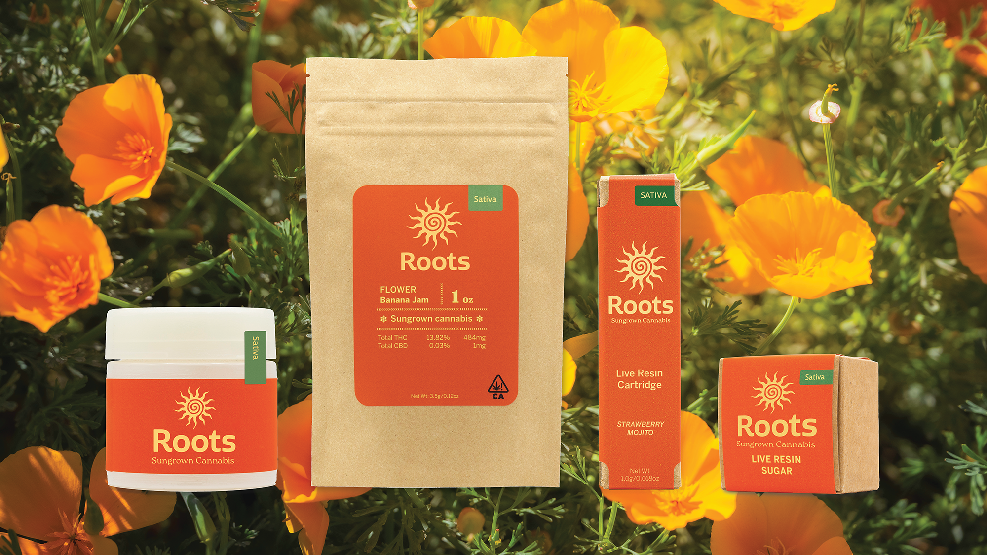
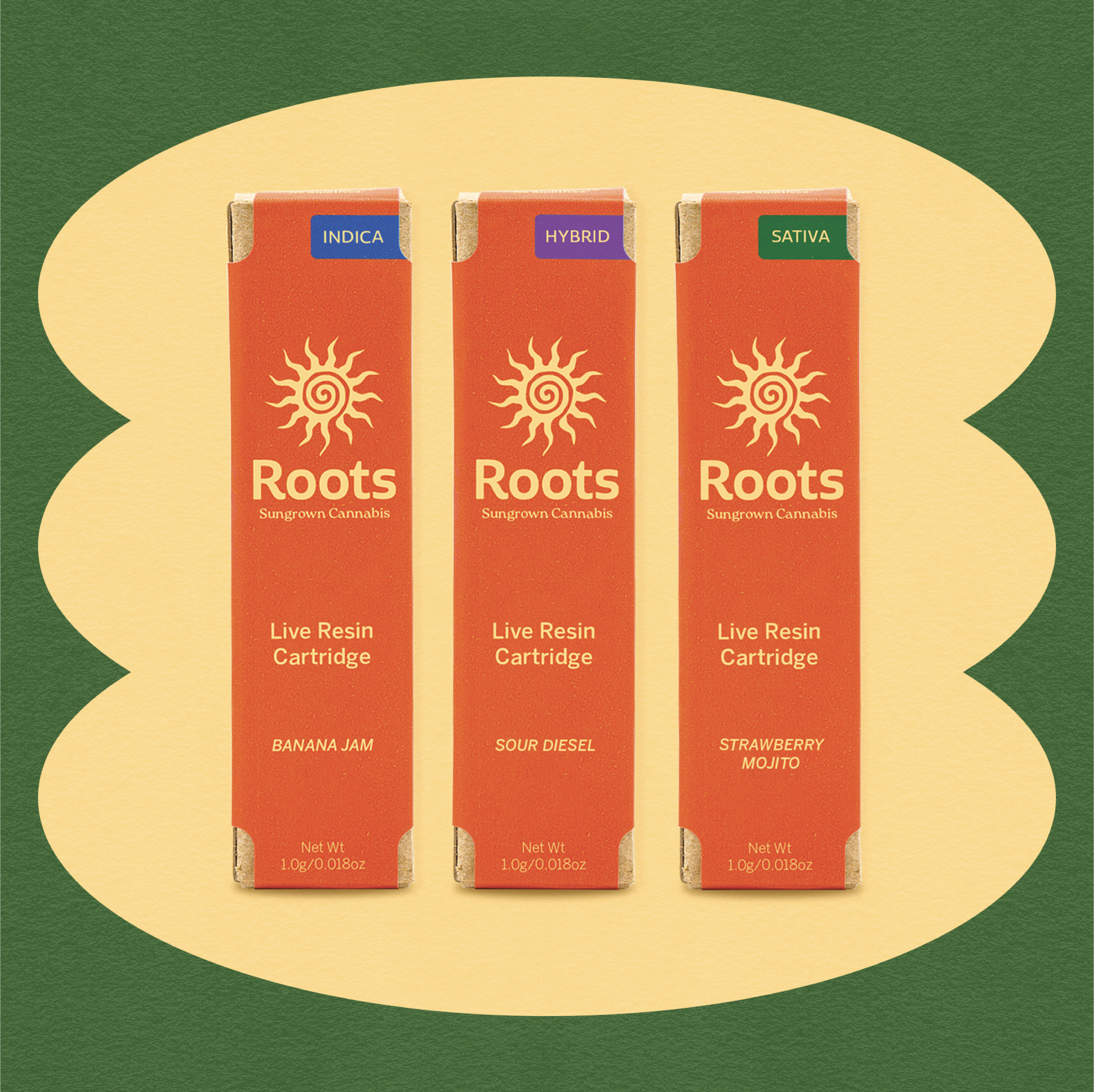
Scalable packaging system for 12 SKUS

Brand Strategy

Collaborating with marketing and packaging leadership, I defined core brand attributes: friendly, warm, approachable, and straightforward. These attributes guided all design decisions, ensuring the visual identity reflected Roots’ sun-grown ethos, sustainability, and premium accessibility.

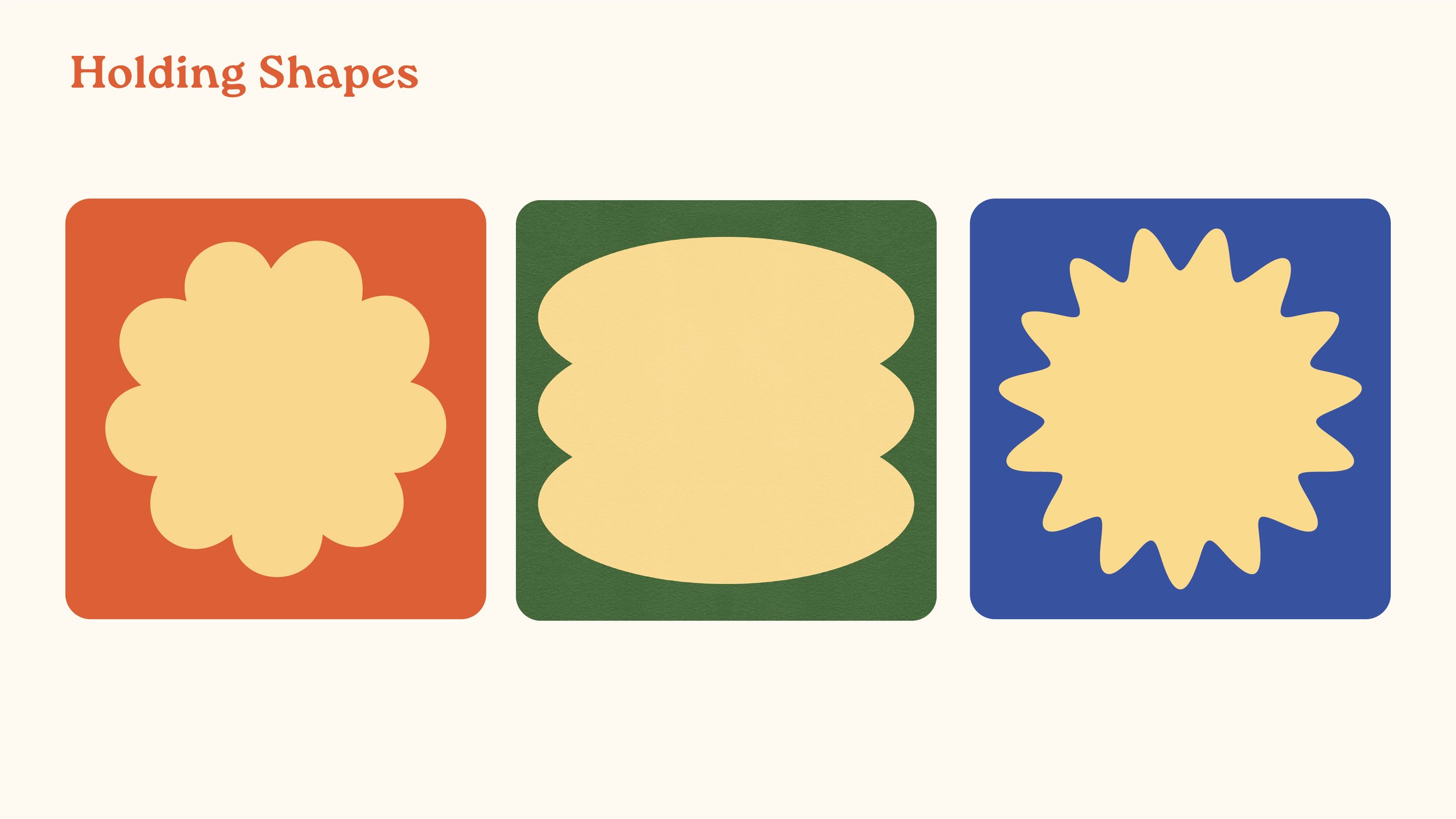
We developed a flexible brand system that could scale across multiple SKUs and marketing touch points while remaining consistent and impactful.

A brown paper bag of cannabis with a red label that reads 'Roots' Sativa, 1 ounce, flower banana jam, sungrown cannabis, and THC and CBD content, placed outdoors in front of a trees-lined road.
A young man wearing a green sweatshirt with a yellow sun and spiral logo on the back, beige pants, and a gray cap, standing outdoors under a clear blue sky, with hands in pockets, looking away from the camera.
Laptop on a wooden desk displaying a website for Roots, a cannabis brand, with an orange background and images of people and cannabis leaves.
Display of cannabis product packaging from the brand Roots, including a jar, a bag, a cartridge, and a box, all with orange and green labels, set against a background of orange and yellow flowers.
A glass bong with water, a small jar of cannabis concentrate, a container labeled 'Roots' with cannabis product info, and a dab tool on sandy ground near water with trees in the background.
Green cursive text that says 'roots' on a white background.

Challenge

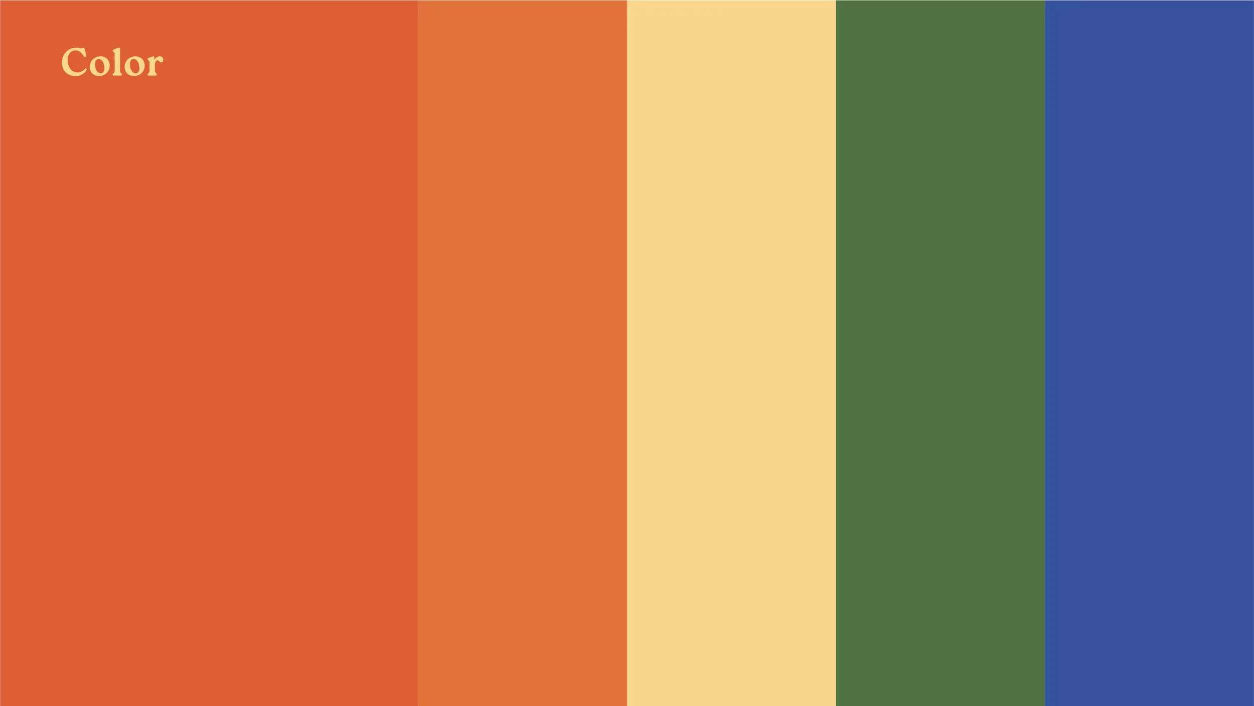
The previous brand identity lacked visual interest and did not distinguish itself on the shelf. The logotype was hard to read due to the script typeface and the “R” being lowercase. The brand utilized the color green, an obvious and common choice for a cannabis brand. 

An orange background with a stylized sun design and the word "Roots" written below it.

Solution

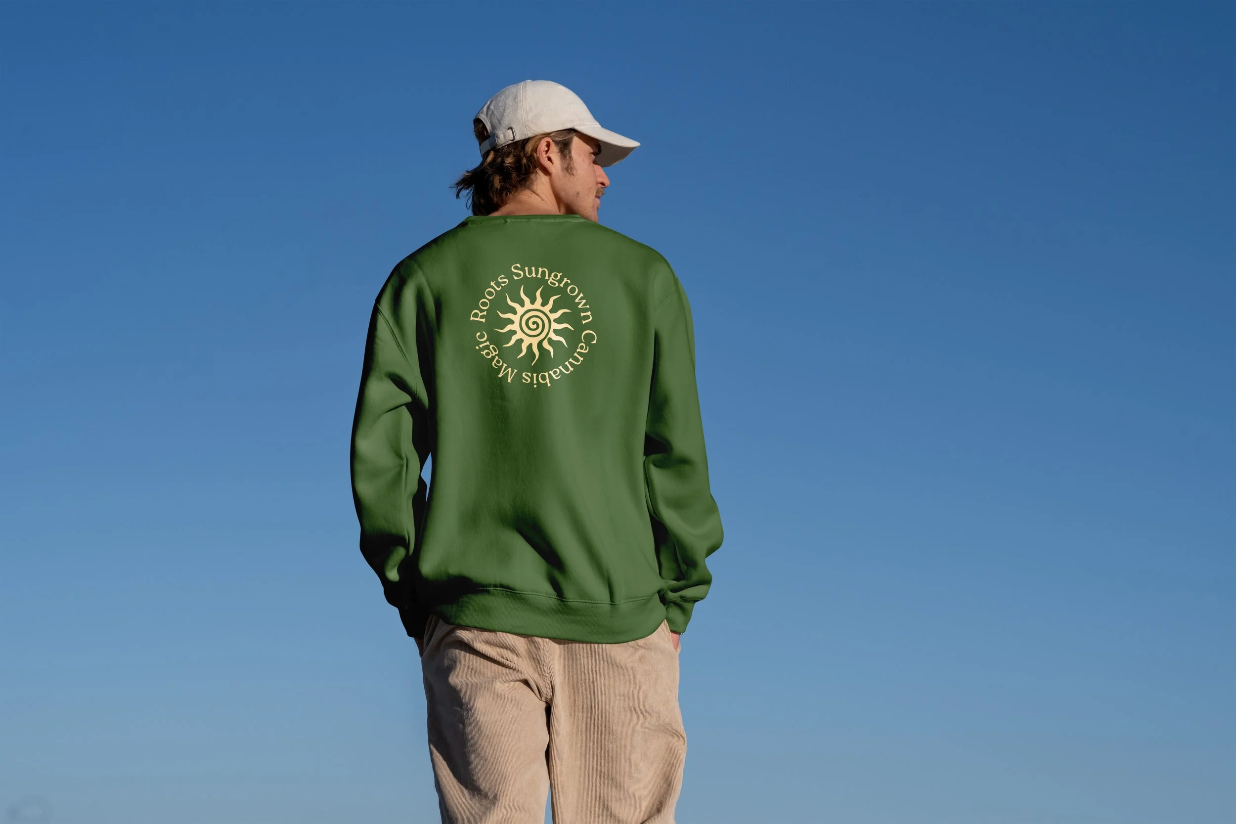
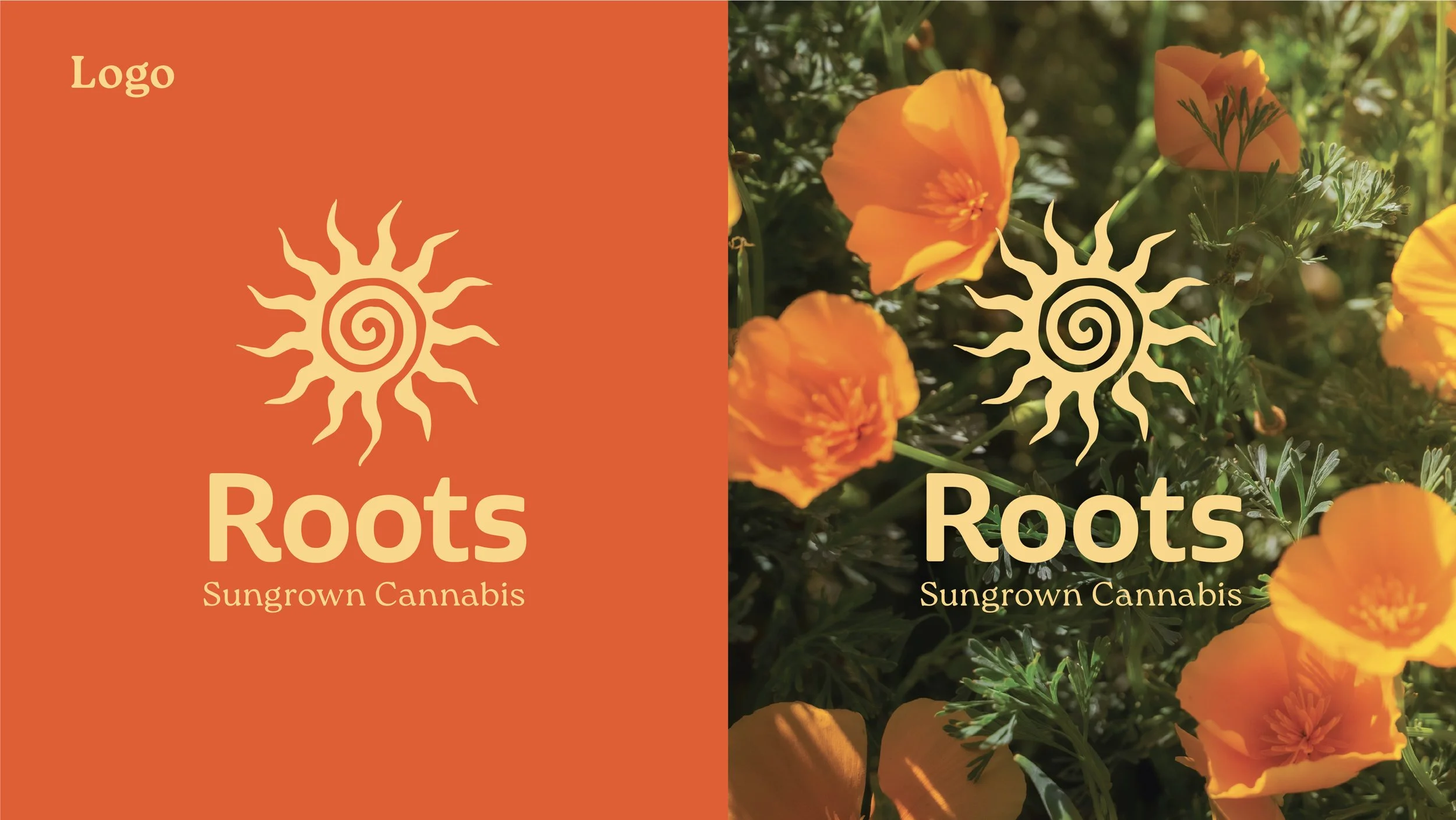
Collaborating with the marketing team, we defined a list of values and attributes for the brand: friendly, warm, approachable, and straightforward which I incorporated into the brand identity with warm colors and a rounded, bold logotype. The sun logo icon is a direct reference that this brand is sun-grown. The orange pops on a shelf, helping the brand stand out from competitors and evokes a sense of positivity and warmth.

Smartphone displaying an Instagram profile page for a brand called Roots, specializing in sungrown cannabis, with images of cannabis products and branding materials.

The Making of Roots

Our approach to developing the visual identity for this sustainable cannabis brand was rooted in balancing environmental consciousness with an evocative sense of nostalgia. We drew inspiration from vintage packaging, retro typography, and analog textures with a modern touch to create a brand world that feels both familiar and timeless. Color palettes were selected to reflect natural tones—earthy greens, sun-faded hues, and recycled paper off-whites—reinforcing the brand’s sustainable ethos. Each element, from logo design to custom illustrations, was crafted to tell a story that honors the past while looking toward a greener future.

Three cannabis resin cartridges in orange packaging labeled 'Roots.' The flavors are Banana Jam, Sour Diesel, and Strawberry Mojito, with each cartridge containing 1.0g of live resin.

Rebrand Before & After

An orange graphic displaying typography samples, including a large headline in bold Roca Bold font, a subheader in Roca Regular font, and body text in a smaller font, with labels for each section.
Two different versions of a logo for a cannabis brand called 'Roots.' The left side features an orange background with a stylized sun icon and the brand name in large font, with URL and tagline below. The right side shows a photograph of orange poppy flowers with the same sun icon and text overlaid.
Two women lying on the ground, one with dark hair smoking a joint and the other with short blonde hair making a peace sign with her fingers over her eye. In a separate image, a man with his back turned wearing a green sweatshirt with the phrase 'Magic Roots Come From Childhood' on it, and a white cap, standing against a bright blue sky.
A colorful graphic displaying the words 'Values & Attributes' with four boxes containing the words 'Accessible,' 'Trusting,' 'Natural,' and 'Playful' in different colors.
A presentation slide titled 'Audience Persona' with a photo of young adults outdoors at a fair or market, and text describing characteristics of a 'cool adult' audience persona, including age, education, occupation, location, values, attitudes, motivations, pain points, and aspirations.
Illustration of four different types of coral, each in a different color: red, yellow, blue, and beige, on a light background.
A collage of three photographs: a close-up of a cannabis plant, a bunch of orange California poppies in bloom, and a forest scene with tall trees along a winding road.

Brand Guidelines

Color swatch showing horizontal bands of orange, beige, green, and blue with the word 'Color' in orange text in the top left corner.
Three colorful squares with different holding shapes on a light background, titled 'Holding Shapes.' The first square is orange with a beige flower-shaped holding shape, the second is green with a beige oval-shaped holding shape, and the third is blue with a beige starburst-shaped holding shape.